top of page
trio2.jpg

The Bettii Pod

Concept Project for Demonstration Purposes

Not Affiliated with Named Company
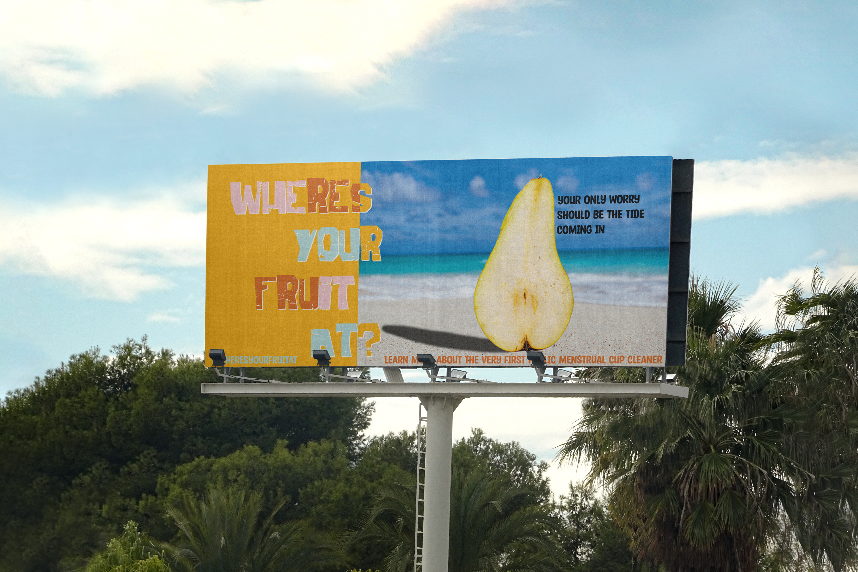
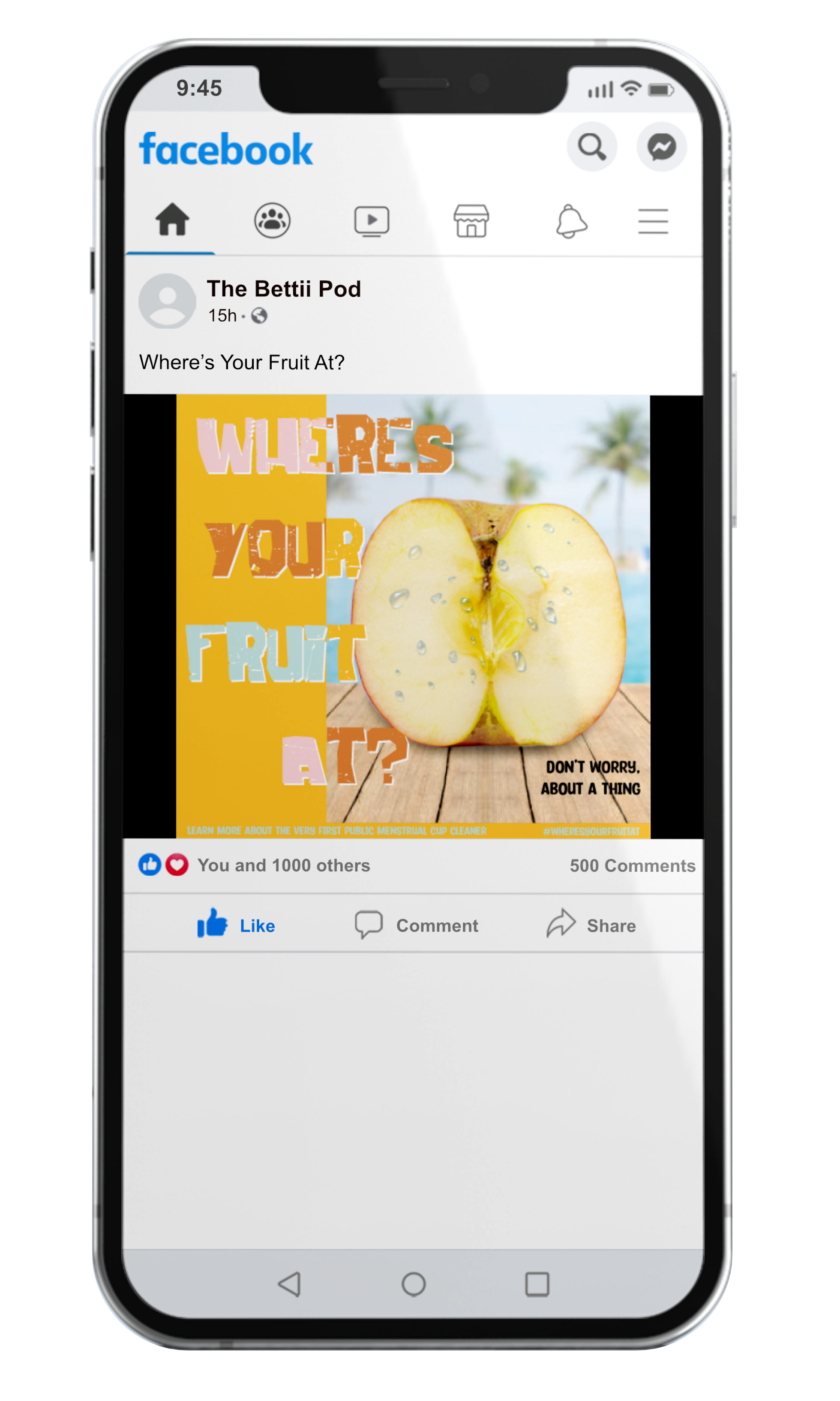
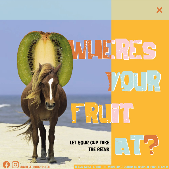
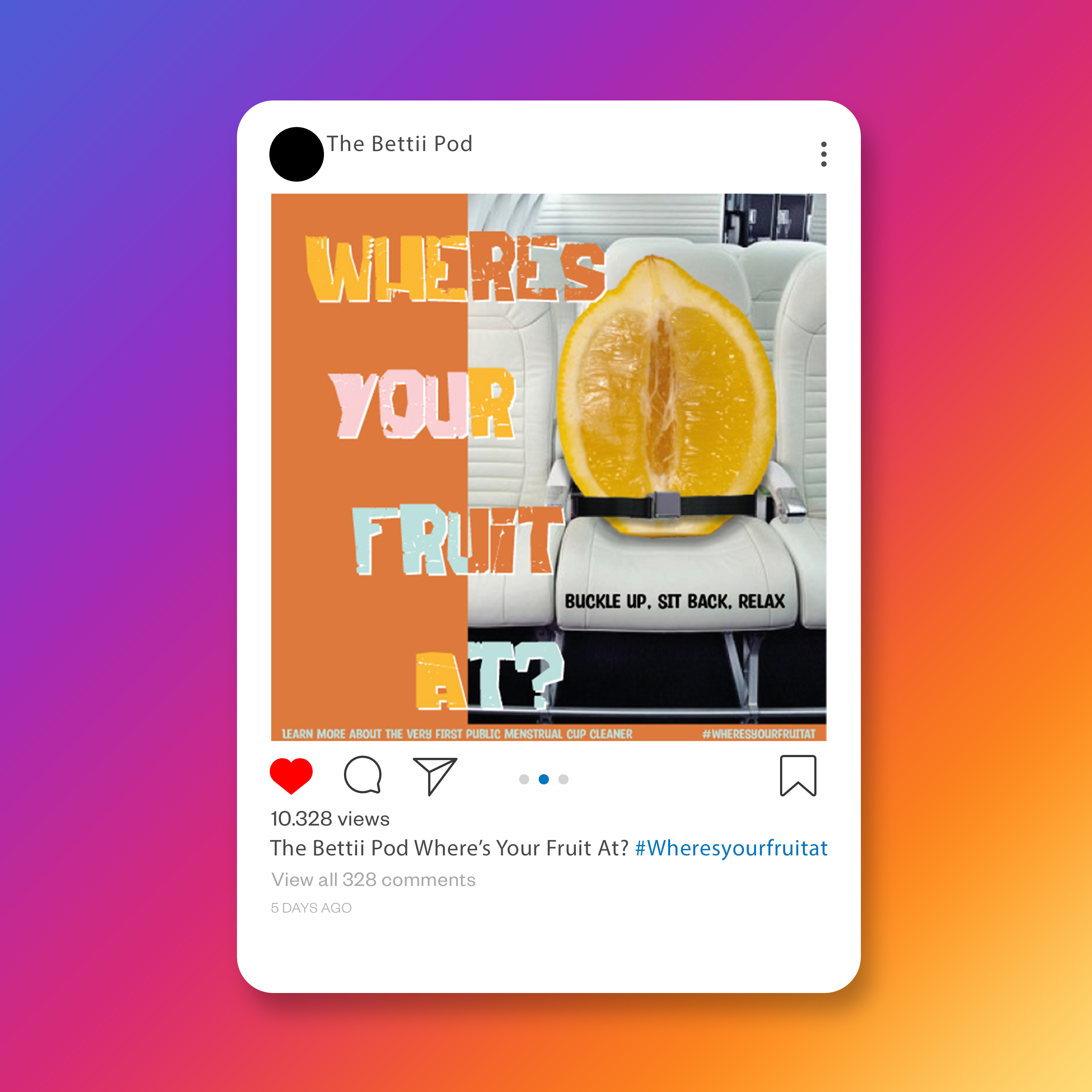
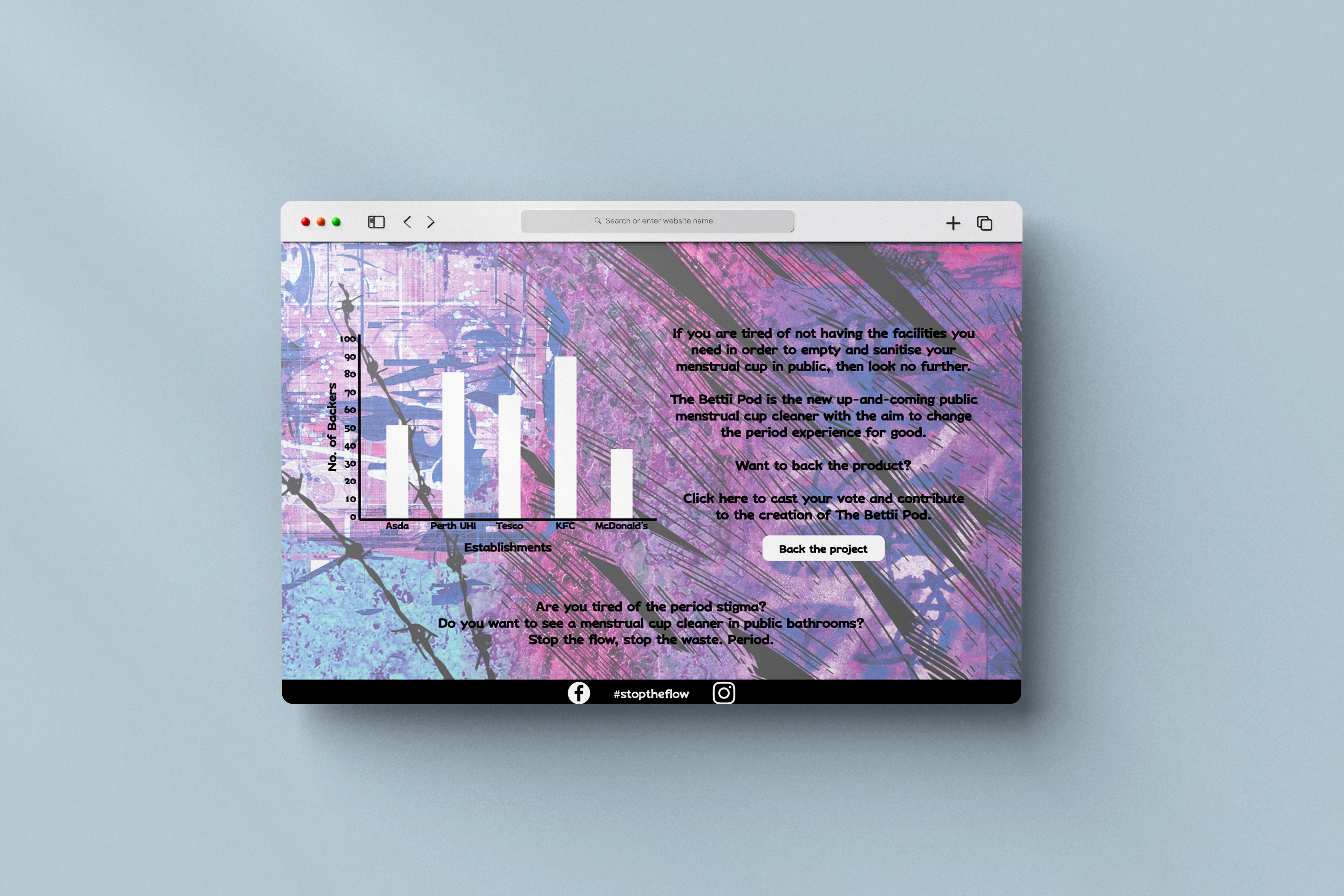
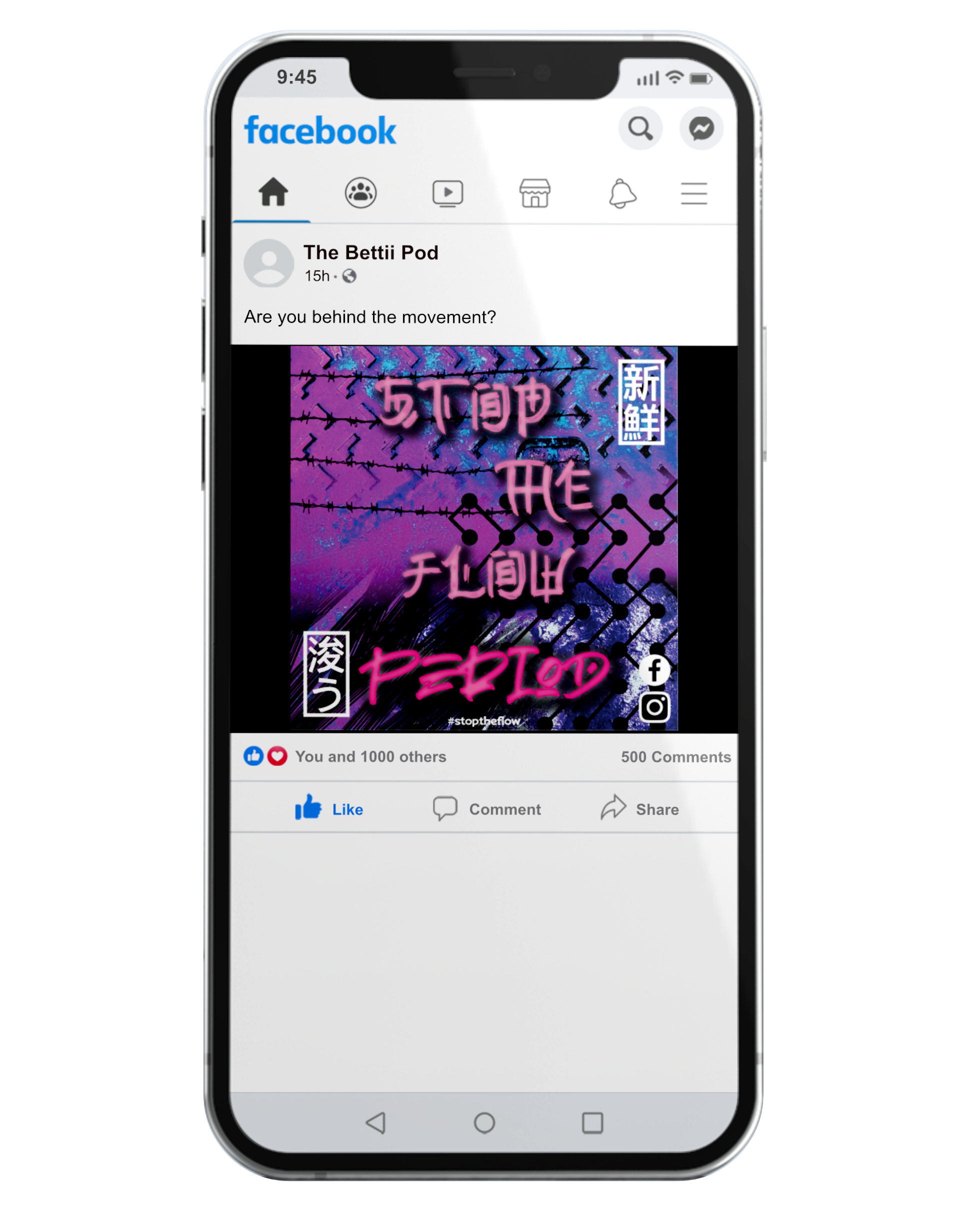
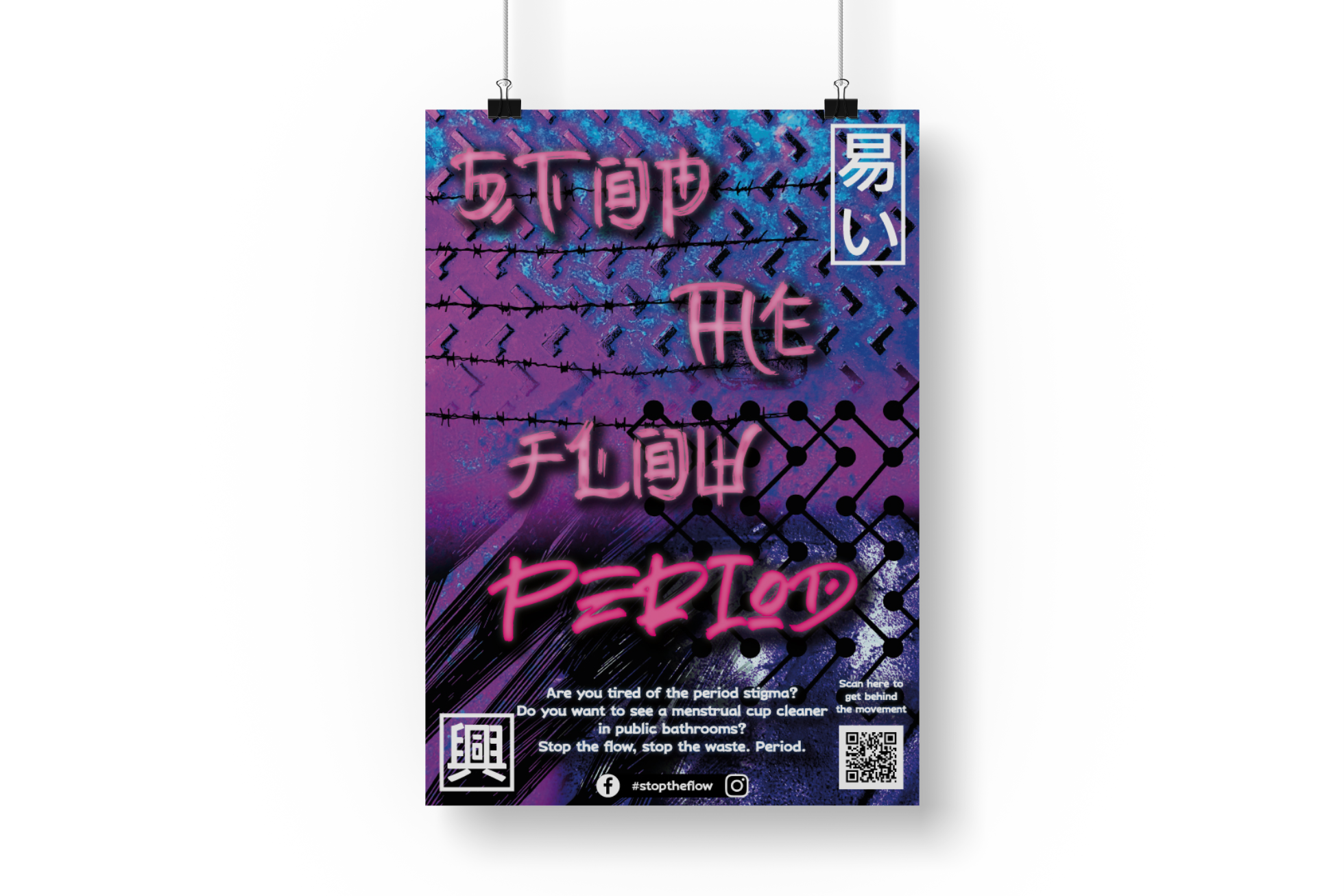
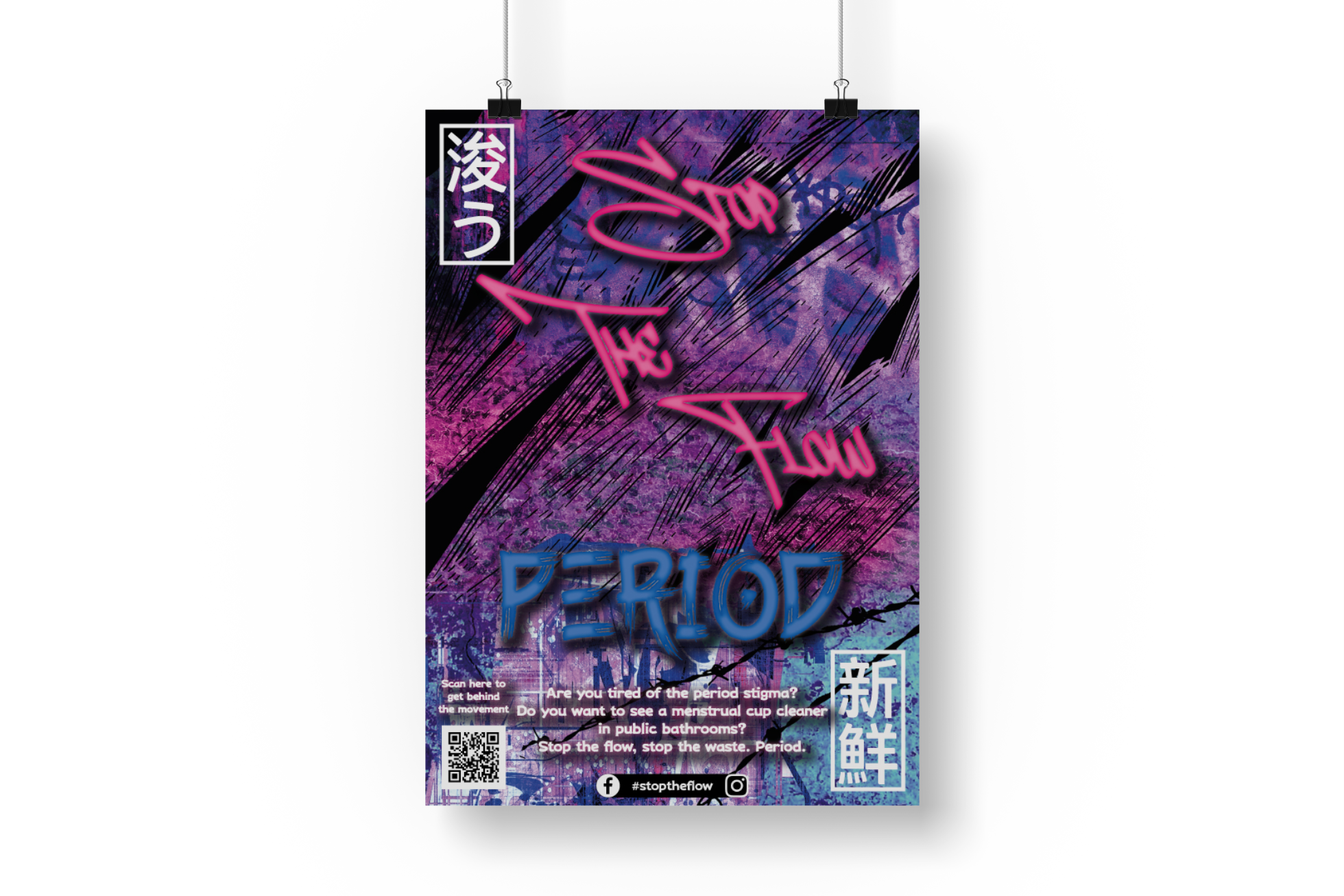
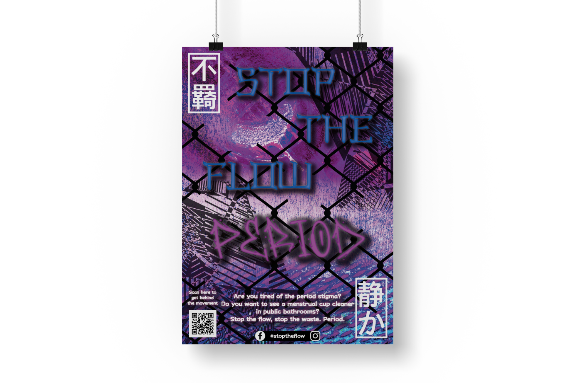
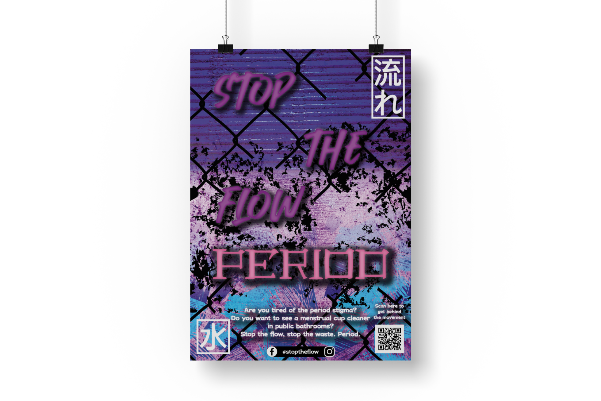
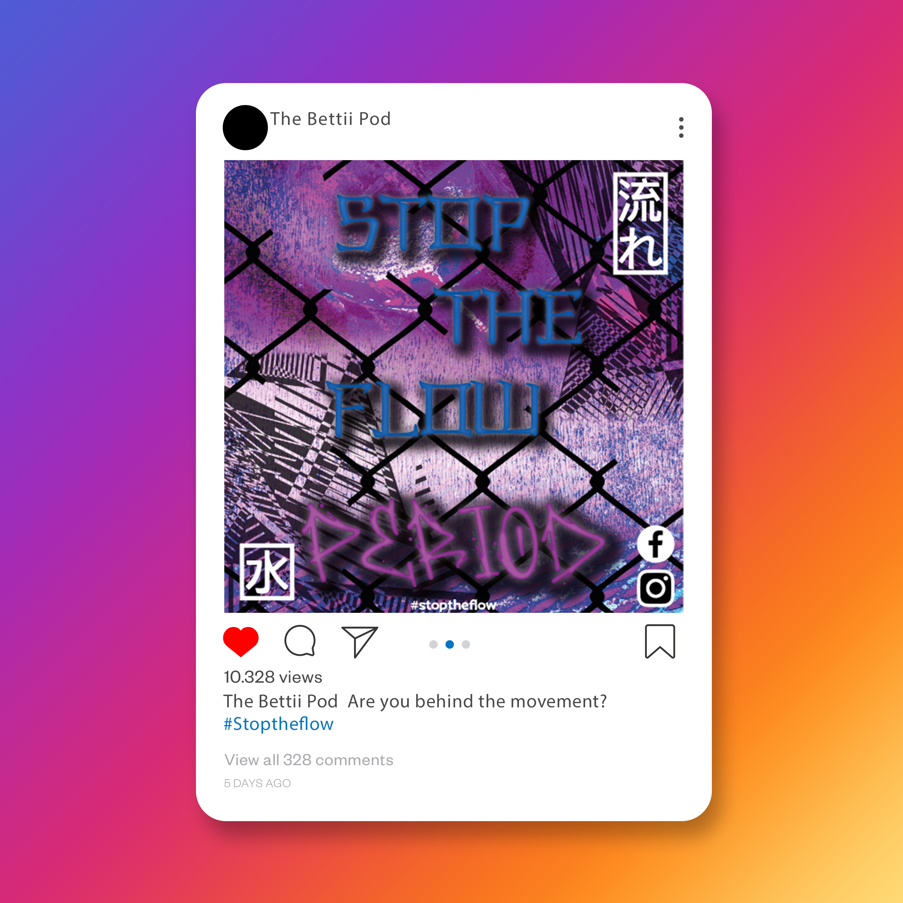
The first collection of images form a vibrant and imaginative marketing campaign for The Bettii Pod, with a clever use of fruit to symbolise human anatomy. Each visual plays with the shapes and textures of various fruits to create a whimsical and engaging take on the human form, while also cheekily connecting to the product — a public menstrual cup cleaner. 


These designs are eye-catching, using a dynamic mix of colours and playful typography that echoes the product's innovative appeal. 


The central motif of fruit serves a dual purpose: it evokes the organic and natural aspects of the product, while also using visual metaphor to discuss menstrual health in a lighthearted manner. This approach not only makes the campaign visually attractive but also destigmatises menstrual cup use by incorporating humour and relatable imagery. 


The campaign smartly adapts across various media, maintaining visual consistency whether displayed on a billboard, social media, or print materials. Phrases like "Where's your fruit at?" and supporting lines that use beach and vacation imagery tie back to the carefree lifestyle the product aims to facilitate. Overall, the campaign demonstrates a fresh, bold approach to product marketing, using design elements that would stand out in both digital and physical advertising spaces. 

billboard for The Bettii Pod showing a pear on the beach
poster design showing a melon riding a water slide
poster of an orange scuba diving
flyers of a plum riding a banana boat in the sea
a modern design of an apple at a swimming pool
instagram advert of a lemon sitting on an airplane seat

Mockup Designed by antonioli / Freepik

pop up advert of a kiwi riding a horse across the sand at a beach

This second series of images for The Bettii Pod marketing campaign shifts to a distinctly urban and Japanese-inspired aesthetic, which is a departure from the initial fruit-themed visuals. The designs are infused with neon colours, bold graffiti-like typography, and elements that are reminiscent of the streets of Tokyo at night. This reflects a raw, edgy vibe that resonates with a youthful, rebellious audience who see themselves as part of a cultural shift. 


Japanese characters and iconography, along with the English text, create a juxtaposition that speaks to a global audience while maintaining a specific cultural reference. The use of barbed wire and urban textures in the background suggests a breaking away from traditional taboos, reinforcing the campaign's message of challenging period stigma and promoting menstrual cup cleanliness in public facilities. 


The visuals are gritty and attention-grabbing, with a call to action that's as bold as the design itself: "Stop the flow. Period." It encapsulates the dual meaning of controlling menstrual flow and stopping the waste associated with traditional period products. The campaign aims at empowering users, with a tone that is assertive and direct, yet inclusive, asking viewers if they're "tired of the period stigma" and if they want to "see a menstrual cup cleaner in public bathrooms." 


In the digital space, these designs stand out on social media feeds and websites, drawing in viewers with their striking visuals and prompting them to learn more. QR codes included in the design provide an interactive element, inviting immediate engagement and further exploration of The Bettii Pod's mission. It's a savvy move that bridges the gap between digital marketing and physical products. 


Overall, the campaign's second concept is bold and confrontational, aiming to disrupt and engage in a conversation about menstrual health in a way that's far from traditional. It's an effective use of visual design to provoke thought and action, aligning well with a product that itself is a game-changer.

poster design of an urban japanese poster for the bettii pod
poster of urban japanese lettering for the bettii pod
website design for the bettii pod showing graphs for establishments and information about the company

Mockup Designed by Freepik

modern design of an instagram advert showing urban japanese lettering spelling stop the flow period

Mockup Designed by antonioli / Freepik

a facebook advert showing urban japanese lettering spelling stop the flow period
bottom of page